Potch.xyz is an online specimen of type designer Potch Auacherdkul. He marked a turning point for typeface projects by Huai which have been recognized by well-known type design competitions.
While attending the Maryland Institute College of Art (MICA) for MFA Graphic Design in 2016, Potch created a remarkable process-based typeface design research ‘State’ for the dissertation and became even more passionate about the letterform after graduation. This passion manifested itself in the completion of the Type@Cooper Extended Program in 2018.
Potch’s typefaces have been honored by the Type Directors Club, Art Director Club, STA Chicago, Morisawa Type Design Competition, amongst many others.
Nicha Keeratiphanthawong is a designer who creates a discourse between what is fleeting and flawed with the permanence of art, translating those remnants into graphical forms and decorative qualities.
Through collaborative projects rooted in the fields of art and culture, design, and exhibition-making, Nicha works alongside artists, curators, designers, researchers, and institutes. Her focus is on design research, spanning conceptualization, content handling, visual, and typographic treatment.
Education
MA, Werkplaats Typografie, Arnhem (ArtEZ, NL) 2020
MA, Information Design, Eindhoven (DAE, NL) 2017 foundation year
Recent Practice is a studio practice focusing on type design, typographic research and design consulting. Founded in 2020 by Potch Auacherdkul and Nicha Keeratiphanthawong, we explore the evolving role of letters in language—both as a means of communication and artistic expression.
Typography is a process of observation, interpretation, and refinement—shaped by language, context, and time. We approach each project by contemplating the nuances, crafting designs that are visually compelling and deeply considered. Whether through custom typefaces or broader typographic structures, we create work that is engaging and responsive to its medium.
Our clients range from cultural institutions and businesses to independent creatives and like-minded collaborators. Grounded in our mission to create an alternative working approach as a global collaborative studio.
We’re always open to new ideas and collaborations. If you’d like to discuss a project or explore possibilities together, feel free to reach out—we’d love to connect.
Awards and Features
Tokyo TDC 2025 Prize Nominee Work
Tokyo TDC Annual 2025
Tokyo TDC Annual 2022
TDC 67 Type Design
TDC 65 Communication Design
2019 Young Ones ADC;
Bronze Cube
STA100 – 2018, 2020
Morisawa Type Design,
Honorable Mention
JosephBinder 2020 Finalist
Print Design Awards,
Regional Winner
ADC Young Ones, Gold Cube
TypeCon 2021
Typewknd 2021
Atypi 2020
NY Art Book Fair 2018-19, MoMA PS1
Yale Art Book Fair 2018,
Yale Art Gallery, New Haven
Pentagram, New York
Deichtorhallen Hamburg
Galería Isla Flotante, Buenos Aires
Books(at)ret, Rotterdam
After8book, Paris
Temporary Bookshelf, Helsinki
SKWAT/ Twelvebooks, Tokyo
Books Atelier, Tokyo
Post-books, Tokyo
Werkplaats Typografie,
ArtEZ University of the Arts
Type@Cooper, The Cooper Union
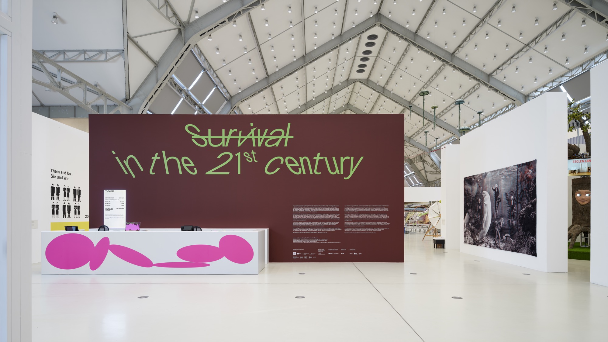
Survival in the 21st Century
Custom typefaces and visual identity for the exhibition Survival in the 21st Century curated by Georg Diez and Nicolaus Schafhausen, Deichtorhallen Hamburg
Image courtesy of Deichtorhallen Hamburg, seen by Henning Rogge
The project received a Tokyo TDC 2025 Prize Nominee and featured in the annual book.
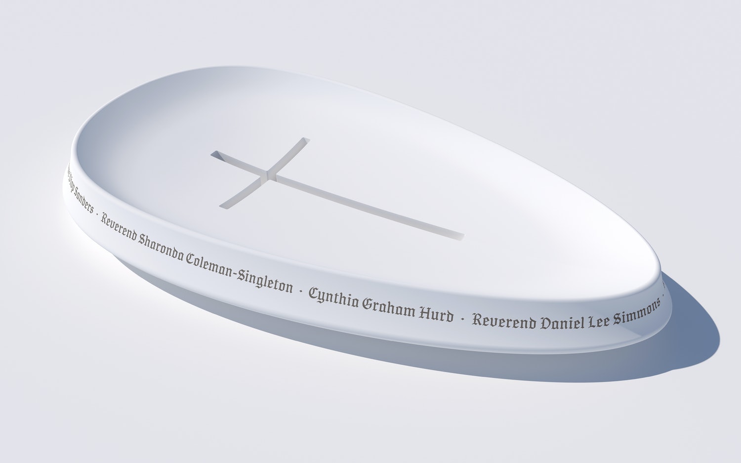
Emanuel Nine Memorial
A custom typeface for the Emanuel Nine Memorial honoring the clergy and members who were murdered at Mother Emanuel African Methodist Episcopal Church in Charleston, South Carolina. Commissioned by Pentagram, New York.
Hand-painted gothic inscriptions on the stained-glass windows of a church capture the solemnity of Pentagram team’s trip to Charleston. The expressive Gothic Textura Script is an homage to these Gothic scriptures and the organic scriptures drawn by a local artist.
The typeface can also be seen on the Memorial website and engraved on the Memorial fountain, a sacred space on the grounds of the church.
Image courtesy of Pentagram
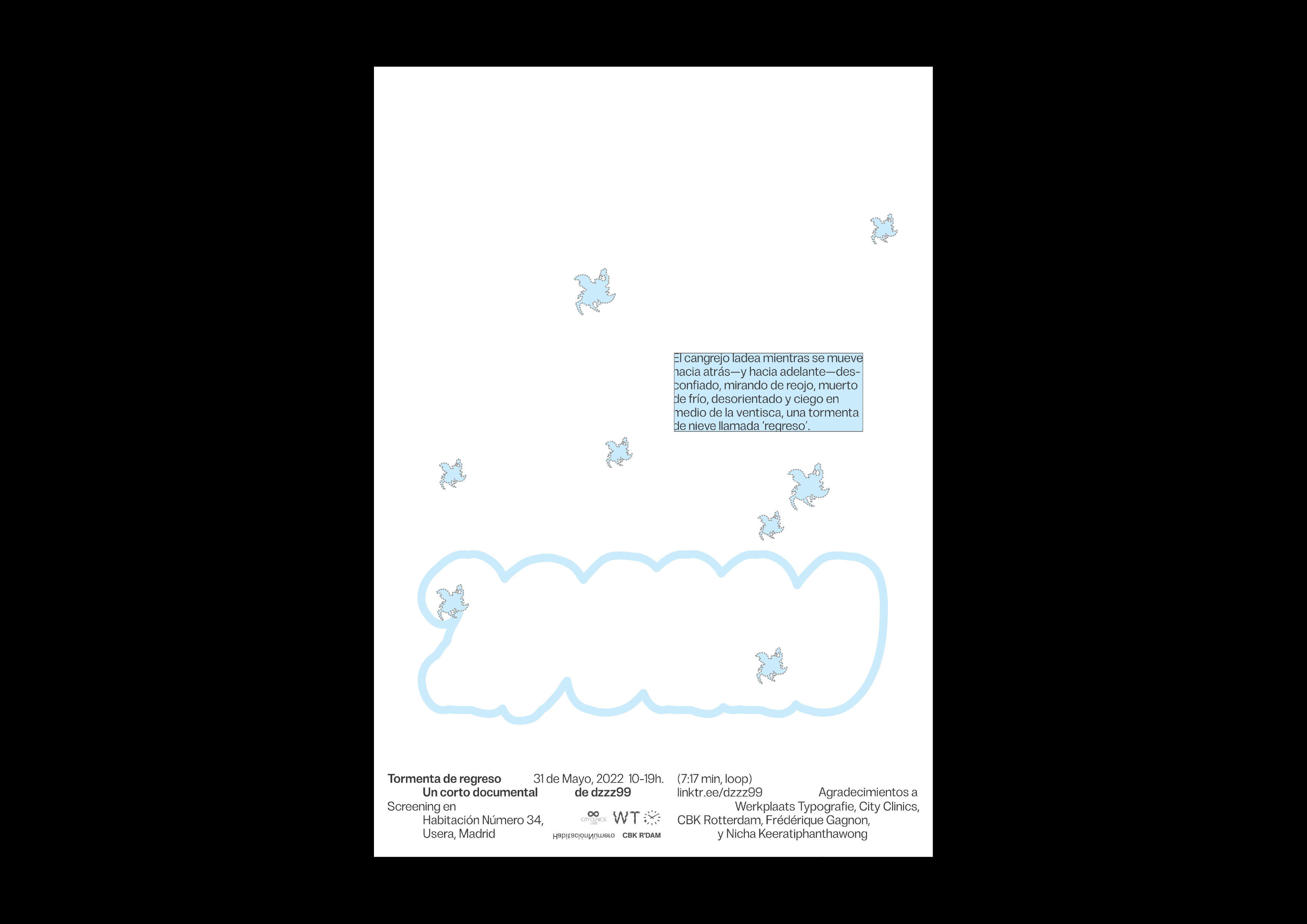
A storm called regress
Visual identity for ‘Tormenta de regreso’ (A storm called regress)
set in a variable font ‘State’
a short-film documentary by dzzz99
screening at Habitacion Numero 34, Usera, Madrid.
The crab faces the side while moving back—and front—suspicious, with the eyes looking askance, freezing, disoriented in the middle of a blinding blizzard, a snowstorm called ‘regress’. —dzzz99
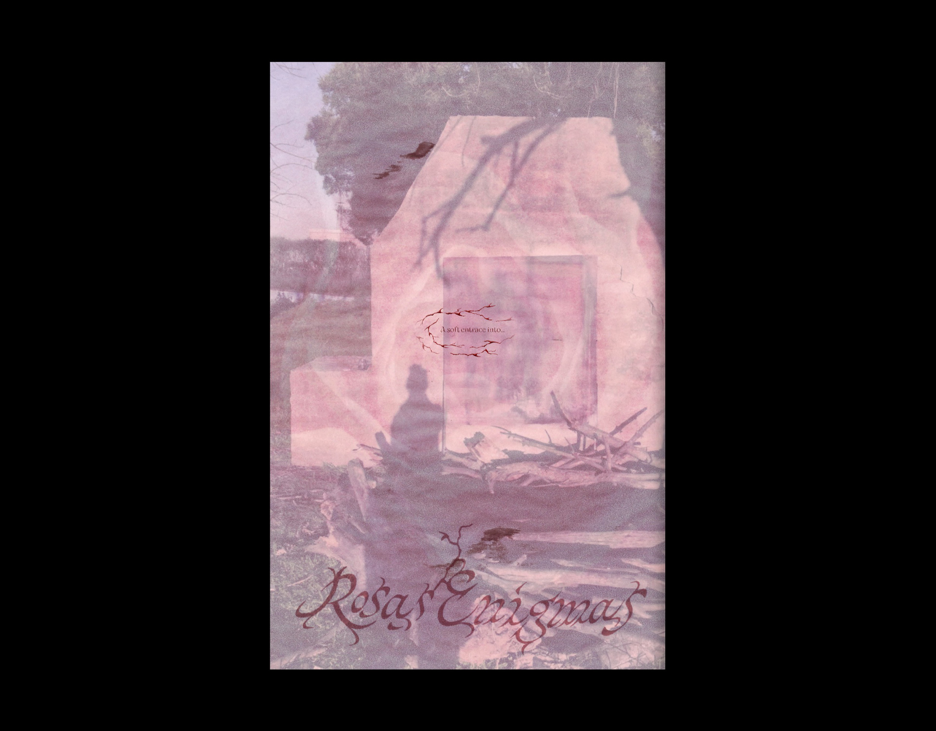
Rosas Enigmas
An artist catalog with the lettering as identity
Published in March 2021, Rosas Enigmas is created by artist Rosario Zorraquin, curator and writer Rosa de Graaf, and designer Nicha Keeratiphanthawong. This online publication, seeks to provide a tangential context for Rosario’s art-making, which will continue to evolve over time. The audio-visual accompaniment is produced by Keeratiphanthawong, using footage taken by the artist and her collaborators.
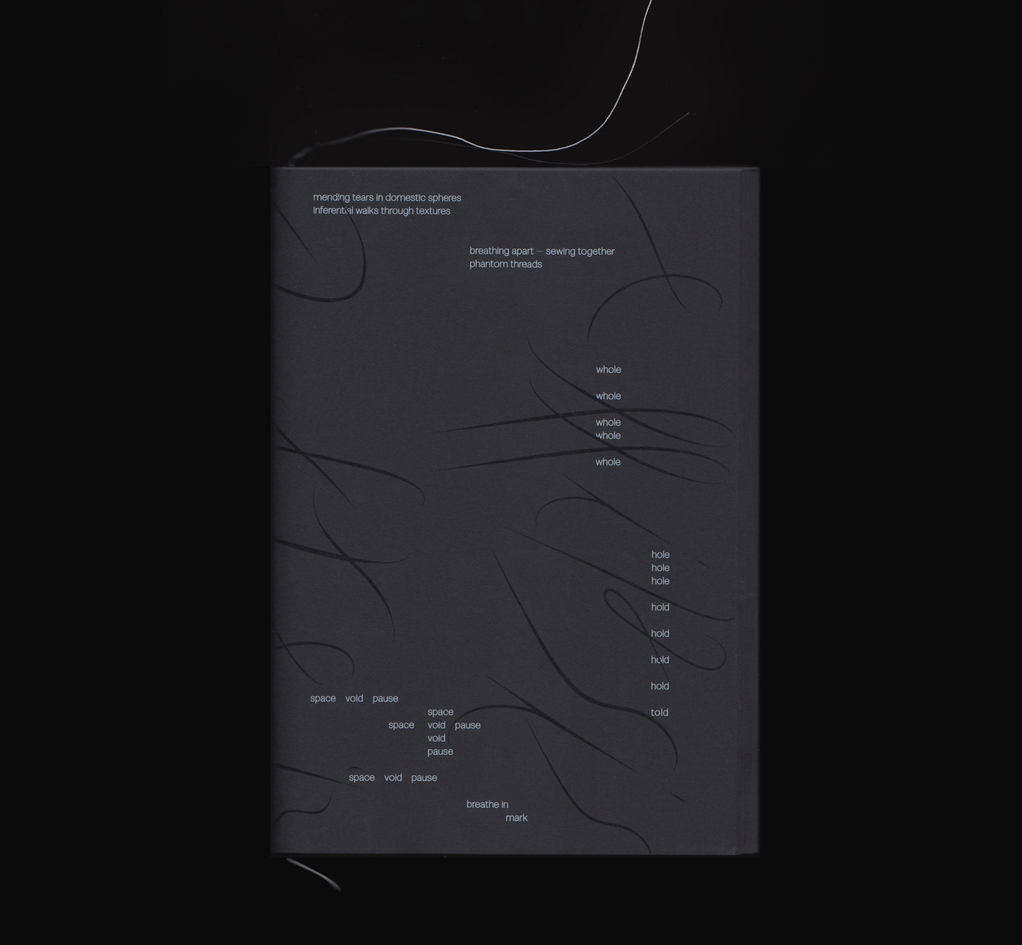
Ellipsis after Closure
Ellipsis after Closure is set in a variable font ‘State’, and a display font ‘Ellipsis’ by Recent Practice
Following endless digital threads of information and being in constant touch with ‘hardware,’ it is easy to forget one’s bodily presence and situatedness. Weavings, just like computer coding, are complex automated nettings. Only the point of rupture—a dropped stitch, like a bug in the code, a systemic error—redirects the attention outside of the machine by requesting a manual intervention.
‘Ellipsis after Closure’ is a show in book form by Tabea Nixdorff and Nicha Keeratiphanthawong, with mended hole contributions submitted by participants who took part in hole mending meditation workshops in 2020.
The book has been selected by Tokyo TDC Annual Awards 2022
and featured in the annual book.
(image courtesy of books.at.ret)
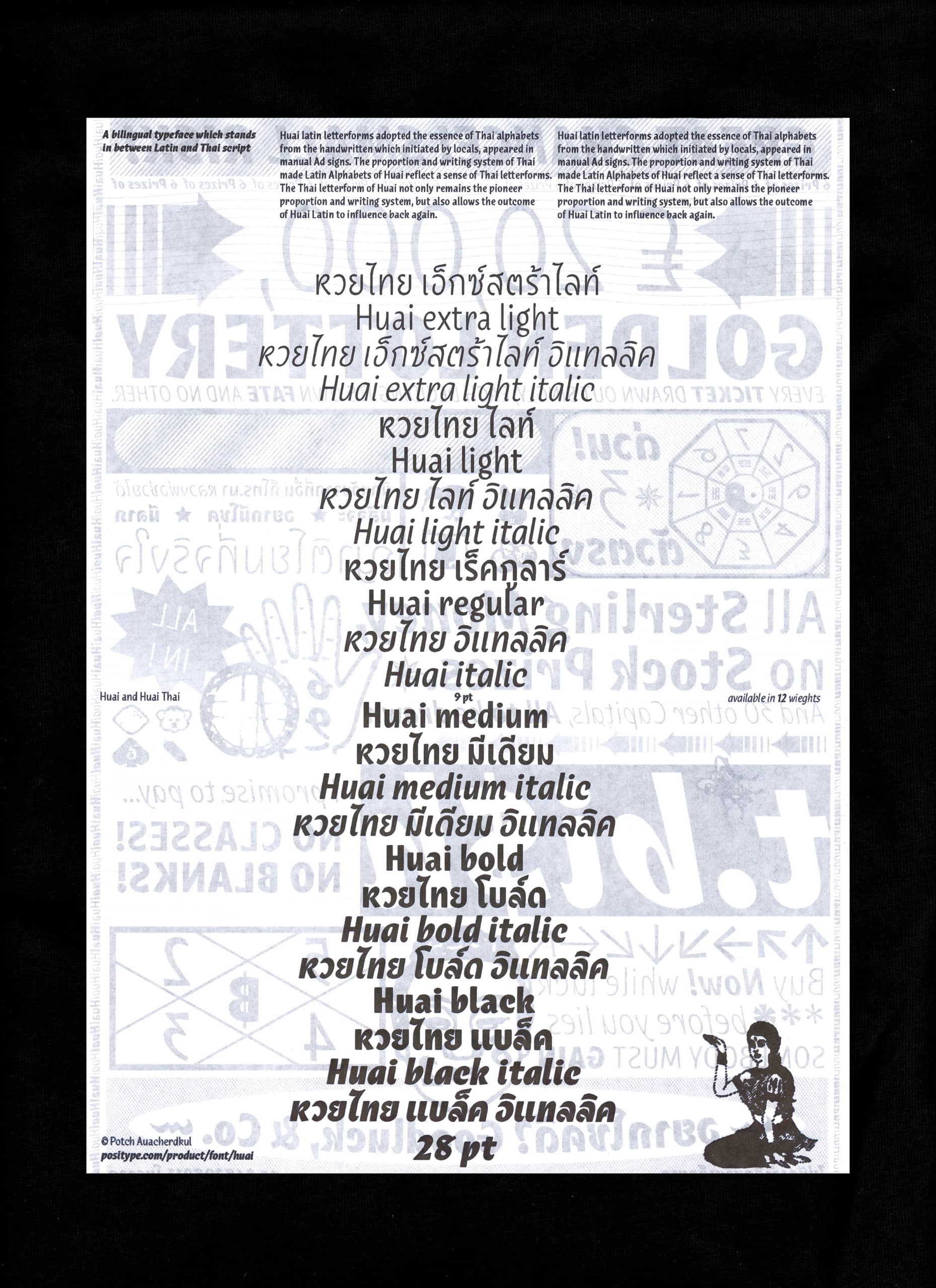
Huai
Huai represents the culmination of research into the duality of influences between handwritten, vernacular Thai lettering and Latin typefaces. The result is a warm, expressive typeface that doesn’t abandon the human hands and the language that produced them.
Awards and features:
ATypI 2020
Joseph Binder Award 2020: Distinction/Finalist, Vienna
Priminister Awards 2020
STA100, a 2020 Design Competition
by Society of Typographic Arts, Chicago
TDC 67 Type Design Competition: Judge’s choice
by Type Directors Club, New York
TypeCon 2021
Typewknd 2021
Jasonhendrikhansma.com
Artist website for Jason Hendrik Hansma
